In the run up to the World Cup season, I had been trying to think of ways to create a single graph that would do a decent job of communicating how good each person’s race was in the context of their past results. Â I wanted something relatively simple and easy to read that would hopefully allow you to just scan down the results and get a quick read on how that day’s race compared to each skier’s historical results.
Here’s what I came up with:
 First I’ll explain, and then I’ll show you the women’s version.
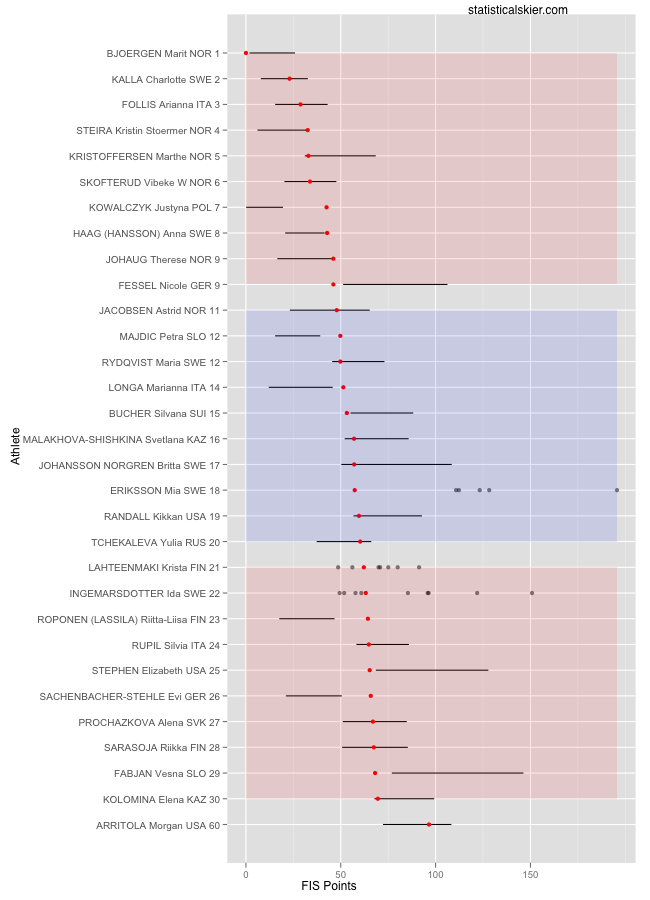
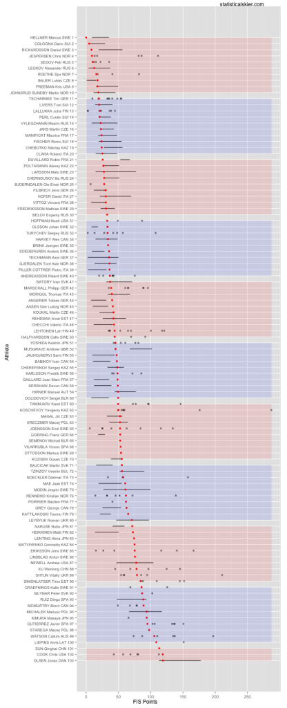
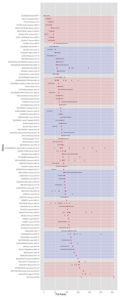
Obviously, each row is an athlete, in the order they finished, in this case the men’s 15km skate race on Saturday in Gällivare.  The red dots are the FIS points for each skier from that race.  The horizontal bars represent the middle 50% of that skier’s FIS point results from WC, OWG or WSC races over the previous three years.  If a skier had fewer than 10 WC, OWG or WSC races over that time period, I plotted the values for the actual races themselves rather than the horizontal bar.
So obviously, if your red dot is to the left of your bar, that’s a “good” race, and if it’s to the right of you bar that’s a “bad” race. Â What’s relevant here is,
- The location and width of the bar representing an athlete’s middle 50% of race results, and
- Where the red dot is in relation to the bar
The blocks of color just mark out groups of ten skiers, hopefully making it a bit easier to scan through to and see roughly what place each skier finished in. Â This is a “reduced” version, showing only the top 30 plus the North Americans. Â You’ll note that the finishing places start jumping up after Noah Hoffman in 31st.
Ok, here’s the women’s version:
 My intention with these graphs really is that they serve as just a snapshot, a quick way to put the race results in some context for each skier. Â The hope is that they will lead to some more interesting things to look at in more depth in subsequent posts.
I didn’t this weekend, but going forward my plan is to have these up as soon as I can on the day of race for WC, TdS and WSC events, with almost no commentary. Â (I can make similar graphs for sprint races using finishing place rather than FIS points.) Â Then I’ll dig a little deeper in follow up posts.
Full versions, which include every racer, are below the fold. Â They are big, so click through for the full versions.


{ 3 } Comments